About
John Cox is a painter, cartoonist, and illustrator for hire. For information about purchasing existing work or commissioning new work, contact him by e-mail at john555cox [at] hotmail.com.
Search
About This Page
This page contains a single entry from the blog posted on February 6, 2012 1:55 AM.
The previous post in this blog was Another one.....
The next post in this blog is "Upon Further Reflection".
Many more can be found on the main index page or by looking through the archives.
Powered by
Movable Type 3.35
Movable Type 3.35
Comments (3)
Cool cover--does anybody else's mind seems to want to drop/rearrange words in the title to come up with other titles/catch-phrases?
I'd buy it--as long it's a cross-label effort to put forth the best of the genre (instead of one of those single-label ripoff compilations that digs WAY back into the catalog to include at least half an album's-worth of "forgotten music nobody wants to remember" like MCA used to churn out).
Posted by Terwiliger | February 7, 2012 12:42 PM
Posted on February 7, 2012 12:42
Yeah, T, me too, in a way. Good observation!
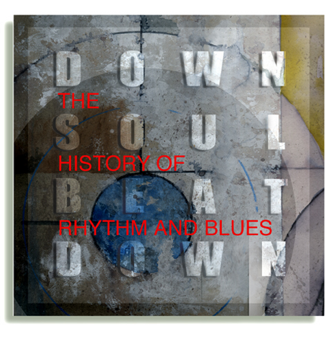
I think the grid format of letters that John uses for "down soul beat down" evokes in me a sense of word search games which leads me to think about rearranging and reconnecting the letters and words.
And because of that, there's also a bit of confusion I feel over whether I should read the words horizontally or vertically or diagonally, etc. While the confusion isn't fun, it also hints at a mystery. And with the clear words in front, perhaps this DVD clarifies the mystery of R&B.
The technique is practically a theme of John's, as we've seen.
For those who care to look, you always have interesting symbolism and emotional effects in your work, John!
Posted by Zeroth | February 7, 2012 2:09 PM
Posted on February 7, 2012 14:09
HEY Z
Thanks for the kind word.
There's a certain musicality in this one; the overlay of tones and interplay of letter shapes seems to mimic soulful notes and phrases that bounce along in a well-crafted tune.
Posted by John Cox | February 7, 2012 9:55 PM
Posted on February 7, 2012 21:55