About
John Cox is a painter, cartoonist, and illustrator for hire. For information about purchasing existing work or commissioning new work, contact him by e-mail at john555cox [at] hotmail.com.
Search
About This Page
This page contains a single entry from the blog posted on February 27, 2012 3:13 PM.
The previous post in this blog was Branded.
The next post in this blog is Say What?.
Many more can be found on the main index page or by looking through the archives.
Powered by
Movable Type 3.35
Movable Type 3.35
Comments (4)
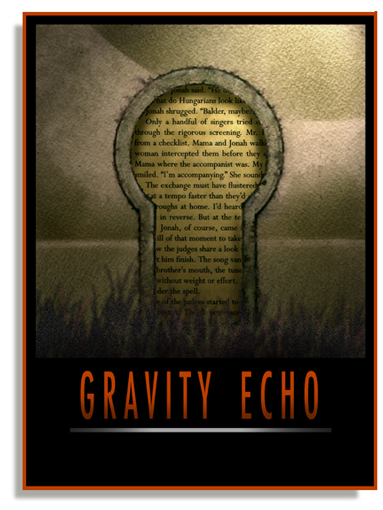
ANOTHER nice one. I like the "patina" & the sense of "age". It just hit me why I like that underlying theme so much; it gives me a feeling of something enduring/immutable.
The "fades" are a really nice touch. Makes me lose track of which layers are front/back.
QUESTION:
Is the text on an otherwise transparent element & layered over the "tarnished" background, or is PS able to add textures to text fields without altering the text?
FWIW, I'm using an old dinosaur app (won't mention name because the manufacturer refused to support it) & I don't have a big enough need/want to justify the cost of PS (adequate vs. best).
Posted by Terwiliger | February 28, 2012 3:07 AM
Posted on February 28, 2012 03:07
HEY T
Thanks for discussing the details. Glad you get the subtleties.
I can layer the type in PS opaquely, letting the lettering texture get the emphasis. I can capture any texture I want and place it into the type.
Or I can layer the type, alter the transparency and let the underlying texture come through.
Usually, it's a combination of both when I'm designing a type look.
Posted by John Cox | February 28, 2012 9:45 AM
Posted on February 28, 2012 09:45
My question was intended to be more along the lines as to whether the text could be isolated from the background when scanning/processing.
I just remembered that I have several rare old books in PDF (in duplicate--one is a "true" copy of the original paper stock, the other is on a white background). Either format lets me copy text without copying the background (although character recognition isn't 100%). If it can be done with bare-bones reader, it can be done in PS (or what I have).
Any recommendations for a relatively effective el cheapo scanner?
Posted by Terwiliger | March 1, 2012 2:18 AM
Posted on March 1, 2012 02:18
AND...
...THANK YOU for answering my previous question. That's more or less how I do it, but I have to be careful. If I save in a "destination" image format, I lose a little bit of sharpness. Multiple iterations & I have a noticeably blurred image. Most of the time I'll effect the background to where I want it, undo 1 iteration, make copies of both elements, fuse the text to the background, then repeat the previous effect. That's usually enough to make the surface blend--& if it doesn't work, I have the backups to copy & re-tweak until I get it right (or close enough).
Posted by Anonymous | March 1, 2012 2:26 AM
Posted on March 1, 2012 02:26