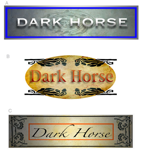
I've been commissioned to illustrate a wine label for a tiny private vineyard in California. I'll add an appropriate visual with it later on, but for now, I wanted to establish the look and feel for the project by nailing the Dark Horse logo first.
« PARLOR TRICK | Main | Say What? »
I've been commissioned to illustrate a wine label for a tiny private vineyard in California. I'll add an appropriate visual with it later on, but for now, I wanted to establish the look and feel for the project by nailing the Dark Horse logo first.
John Cox is a painter, cartoonist, and illustrator for hire. For information about purchasing existing work or commissioning new work, contact him by e-mail at john555cox [at] hotmail.com.
This page contains a single entry from the blog posted on February 21, 2008 12:29 AM.
The previous post in this blog was PARLOR TRICK.
The next post in this blog is Say What?.
Many more can be found on the main index page or by looking through the archives.
Comments (16)
Are you entertaining font suggestions? Try these (if you're going to use a pre-fab font):
(1) Centaur bold italic
(2) Poor Richard italic
(3) Goudy Old Style bold italic
Condense the font spacing & they won't look as generic.
Posted by Terwiliger | February 21, 2008 4:35 AM
Posted on February 21, 2008 04:35
The bottom one...it looks very Manichewitz-y, like it would be found in an old bubbe's cupboard, no?
:-)
Posted by Erica | February 21, 2008 7:25 AM
Posted on February 21, 2008 07:25
The dictionary says "a dark horse candidate is one who is nominated unexpectedly, without previously having been discussed or considered as a likely choice."
I'm trying to think of what a logo would look like that I might initially ignore, but then come back to choose...
An interesting contradiction in goals - design a logo obviously intended to be noticed but one that conveys the feel of something initially overlooked.
This is why I'm an engineer instead of an artist.
Posted by BilgeRat | February 21, 2008 8:49 AM
Posted on February 21, 2008 08:49
I like the third design best.
Posted by Jason Trommetter | February 21, 2008 9:18 AM
Posted on February 21, 2008 09:18
I'm with Jason. 3rd one begs for a horse head logo.
Posted by GarandFan | February 21, 2008 9:58 AM
Posted on February 21, 2008 09:58
I might as well go all in and make my choice known publicly. "C" it is, it grabbed me.
The name is due to the skepticism I started with, and I actually have a dark horse.
Thanks for the comments everyone.
Cheers
Posted by Allen | February 21, 2008 2:00 PM
Posted on February 21, 2008 14:00
Remove the oval from "B".
Posted by Stormwatch | February 21, 2008 6:19 PM
Posted on February 21, 2008 18:19
I would take the 3rd font and add it to the 2nd art element. If I could draw like you though, I'd probably script my own typeface.
Posted by Doug Toney | February 21, 2008 7:05 PM
Posted on February 21, 2008 19:05
I'd go with #3 as well. Add a rearing black horse and there you go.
Posted by Laura | February 21, 2008 7:19 PM
Posted on February 21, 2008 19:19
HEY EVERYONE
Thanks for the input. I'll be showing the finished piece soon. There's more to this than you know.
Posted by john Cox | February 22, 2008 3:48 AM
Posted on February 22, 2008 03:48
I feel like doing a little Don Rickles bit. No offense intended.
ERICA
It's "Dark Horse"--not "Dark Chchchorse."
BILGERAT
"Product packaging designed to be initially overlooked..."
You're an engineer. No kidding.
Posted by Rutager | February 22, 2008 5:45 AM
Posted on February 22, 2008 05:45
AND TERWILIGER
Get a life!!!
Posted by Rutager | February 22, 2008 5:46 AM
Posted on February 22, 2008 05:46
Hey John!
You getting paid 'in kind'?
:o)
Posted by GarandFan | February 22, 2008 6:09 PM
Posted on February 22, 2008 18:09
C is the way to go, imho :) The main issue I see with A and B are the font shadows - the illusion of 3D just doesn't go well with a flat bottle label. Also, the font in C helps create an atmosphere of mystery, darkness, also speed.
Posted by Kukn | February 22, 2008 6:53 PM
Posted on February 22, 2008 18:53
HEY G
As a matter of fact, I will be given a couple bottles plus the agreed fee.
Posted by john Cox | February 23, 2008 4:29 AM
Posted on February 23, 2008 04:29
Just a 'couple'? Or a couple of 'cases'? :o) Hick!
Posted by GarandFan | February 23, 2008 7:27 PM
Posted on February 23, 2008 19:27