About
John Cox is a painter, cartoonist, and illustrator for hire. For information about purchasing existing work or commissioning new work, contact him by e-mail at john555cox [at] hotmail.com.
Search
About This Page
This page contains a single entry from the blog posted on November 18, 2011 4:56 PM.
The previous post in this blog was KiRKWOOD.
The next post in this blog is Quiptoons.
Many more can be found on the main index page or by looking through the archives.
Powered by
Movable Type 3.35
Movable Type 3.35
Comments (4)
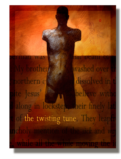
Wow. Great work. I really like this one (although the membrum/???? seems odd, given both arms & both legs are gone--& please excuse my ignorance if there is a torso from antiquity like this).
I really, really like the colors & the overall effect--& I think this would have been a better title than the original.
I find myself wanting to be offended by the way the words are "fitted," but that's exactly the way they fall on that page of the book (I wonder how certain people might react if their "prophet's" name was put in the same place).
As far as the book--actually, I should say as far as the author, since all of his books I've come across are like this--I was worn out by the forced (& overplayed) social commentary.
He's one heck of a writer--but as his books wear on, I find myself less & less reading & more & more skimming for the "good parts"--mainly to see a really talented writer's craft (& perhaps to draw some bit of inspiration as impetus).
Posted by Terwiliger | November 19, 2011 4:31 AM
Posted on November 19, 2011 04:31
Hey T
Thanks for the aesthetic input. I appreciate hearing how this kind of work is received.
I definitely was going for a slightly disturbing, thought-provoking look.
Posted by John Cox | November 19, 2011 2:03 PM
Posted on November 19, 2011 14:03
FYI
The text on the cover (which contains John's title) is taken from The Time of Our Singing by Richard Powers.
Posted by Anonymous | November 21, 2011 4:25 AM
Posted on November 21, 2011 04:25
HEY ANON
Thanks for that info. I have a huge stack of random pages I use for type effects. Purely random.
Posted by John Cox | November 21, 2011 11:21 AM
Posted on November 21, 2011 11:21