My good friend who hosts The Phantom Darkroom, Steve McAfee, is a skillful photographer of a high order. His work is known around the country and even HE has to refresh his business cards so they reflect his recent interests and techniques.
His most recent post was about that very thing, which I found to be inspiring. So, with a few hours available to really knuckle down and come up with my business card......I FROZE!
I didn't have a clear idea of what I wanted to present to the world as my "it", my specialty, that thing that makes my work stand out. I'm aware that I've developed a few looks, so I was a bit confused as to a stylistic direction.
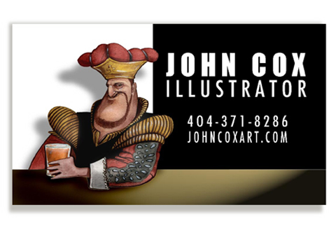
Then, I took a deep breath and realized the work I've been showcasing on this site is the marrow of my artistic efforts: highly detailed cartoon work that emphasizes form, texture and light, with a certain wry humor.
And that's what I went with. WHEW!
I think it's hilarious that when it came to designing my own card, I was a bit befuddled. Had I been doing work for anyone else who required my illustration and design work, I would've gone about it with my usual confidence and focus. I-R-O-N-Y.
Comments (9)
Great card, John! It's good to be the king. :-)
I think you know yourself, your complexities, your potential too well to reduce it all to one business card. That's why Steve's advice to periodically change the card is so good -- it relinquishes you from that impossible task and permits you to view the card as a snapshot, a slice of the pie, and not the whole pie.
And what a slice it is. :-)
Posted by Zeroth | February 16, 2012 12:18 PM
Posted on February 16, 2012 12:18
The King of illustrators!
Posted by Craniac | February 16, 2012 1:35 PM
Posted on February 16, 2012 13:35
Looking closer that may be the Court Jester of Illustrators.
Posted by Craniac | February 16, 2012 1:40 PM
Posted on February 16, 2012 13:40
HEY Z
Thanks for the kind word. A "snapshot" is quite apt. Helpful thoughts, Zeroth.
Hey C
This was the character off one of my beer label ideas, King's Lager.
Posted by John Cox | February 16, 2012 5:06 PM
Posted on February 16, 2012 17:06
I really like this as an illustration. I also have some ideas:
(1) Use your web banner as the basis for the background instead of black & white blocks (although they're a nice allusion to C&F). To retain the black block, use the right side of your banner, render it in reversed colors (sorta "negative"--black with tan lines), & use thinner lines for that part of the graphic (so it doesn't clash with the text--or leave it tan, weaken the lines, & make the text black).
(2) Replace the "bar" at the bottom of the card with the pencil from your banner.
(3) Use custom card stock so the body of the pencil is on the standard card area & the point extends beyond it.
Or maybe just put a feather quill pen in his beer.
Just bouncing ideas.
Posted by Terwiliger | February 16, 2012 6:43 PM
Posted on February 16, 2012 18:43
HEY T
I appreciate your input.
Here's the thing:
If the card is overly "designy" and distracts from the lively illustrated character, I miss the opportunity to zero in on The Feel. I show off with design elements and the card portrays a GRAPHIC DESIGNER, not an ILLUSTRATOR. Isn't there a crossover? You betcha. It's a tiny card, though; one idea at a time..
Oy, I've been down that blind alley....
Posted by John Cox | February 16, 2012 7:02 PM
Posted on February 16, 2012 19:02
Gotcha. Just typing out loud.
Posted by T again | February 16, 2012 10:03 PM
Posted on February 16, 2012 22:03
HEY T
I always appreciate honest discourse. No worries.
Posted by John Cox | February 16, 2012 10:41 PM
Posted on February 16, 2012 22:41
It may be just a tiny bit stark, but I like it. I also liked the condensed version of your web page banner in the animated GIF on the old Cox and Forkum. I do think it would be good branding if your card and your site had a little something in common, but I don't know how to go about doing it.
Posted by Anonymous | February 17, 2012 6:22 PM
Posted on February 17, 2012 18:22