48" x 24"
oil on canvas
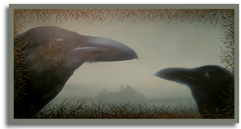
This is part of a new body of work I have going at my studio. I've been trying to recall my southern roots and painting what I consider to be my version of Southern Gothic. I'd like the artwork to be mysterious and dream-like with just a hint of eery. Yet, I'd like to keep them beautiful...somehow.
Comments (11)
Maybe you could work in some upside-down pentagrams or a goth-style Scarlet O'Hara. You could be the antithesis to Thomas Kincaid.
Actually, I really like the concept. The one you posted a while back... it had work gloves on a chopping block or a fencepost... that one & the "blue farmer"... they seemed to have the same kind of vibe (but not as dark).
Posted by Terwiliger | April 2, 2009 1:46 AM
Posted on April 2, 2009 01:46
...& I'll bet I spelled "Kincaid" wrong.
Posted by Anonymous | April 2, 2009 1:47 AM
Posted on April 2, 2009 01:47
I don't think there is any inherent contradiction between the grotesque and the beautiful. (Well, maybe sometimes in the trailer-park next door to me.) You're integrating them with Flannery O'Connor aplomb, I think.
Posted by Candice Dyer | April 2, 2009 3:14 AM
Posted on April 2, 2009 03:14
All I can say is, Wow! First the pears, now the ravens - you're going to compel me put away all my current art and decorate my walls with your stuff from now on.
Posted by Doc Al | April 2, 2009 8:16 AM
Posted on April 2, 2009 08:16
"Going Southern", I can relate to that. You should see my collection of Elvis on black velvet.
Posted by GarandFan | April 2, 2009 10:25 AM
Posted on April 2, 2009 10:25
HEY DOC
Neat. I find it intriguing how the paintings can hit your interests like that.
Posted by john Cox | April 2, 2009 3:51 PM
Posted on April 2, 2009 15:51
Love the 3-D effect. It's stunning! Can't tell on the 'puter, I believe that this improves with distance...does it have an impressionistic effect?
Posted by Cowboy | April 2, 2009 11:08 PM
Posted on April 2, 2009 23:08
Het Cowboy
No, it's rather tight in certain areas and a little blurry in others. I was going for a depth of field effect. The piece is pretty dang tight overall. Impressionistic is just a minor side effect.
Posted by john Cox | April 2, 2009 11:20 PM
Posted on April 2, 2009 23:20
I really liked this yesterday--& I still like it today.
However...
The border on the top & the sides isn't working for me.
To my taste, it would really punch things up if there were 3 or 4 twisted old trees beyond the house & in the intermediate space between the house & the crows.
Maybe a pin oak, a magnolia, a birch, & some hazy "moonlight through the pines."
Not a criticism... Just a thought.
Posted by Terwiliger | April 3, 2009 12:59 AM
Posted on April 3, 2009 00:59
HEY T
WHEW! That was close. Thanks for saving my painting! I've got to check with you more often before I begin my work.
Now, what size paint brush should I use for the changes?
Posted by john Cox | April 3, 2009 1:36 PM
Posted on April 3, 2009 13:36
HEY J
Gee whiz. It was just an idea. Maybe use it on the next one. Maybe not.
If I knew which brush to use, I'd be doing this myself. I have MEGA admiration for your talent. GIGA even.
Concepts, I get. Impressions, I get. The big picture, I get.
Details? Brush strokes? I am LOST.
Posted by Terwiliger | April 4, 2009 2:08 AM
Posted on April 4, 2009 02:08