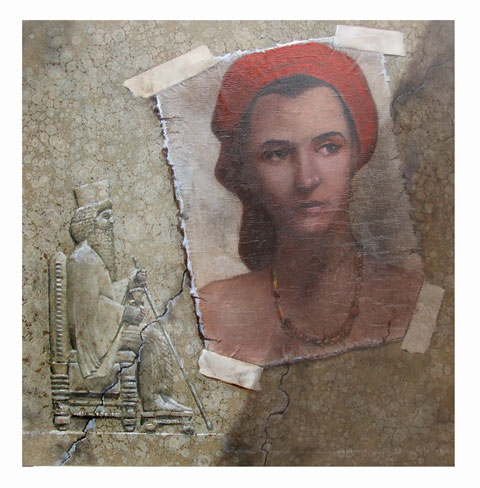
The art director and I decided to tweak the cover illustration. Thank goodness I beat the deadline by a few days so I could have a chance at making changes.
« BETWEEN POSES | Main | Baby Whisperer »
The art director and I decided to tweak the cover illustration. Thank goodness I beat the deadline by a few days so I could have a chance at making changes.
John Cox is a painter, cartoonist, and illustrator for hire. For information about purchasing existing work or commissioning new work, contact him by e-mail at john555cox [at] hotmail.com.
This page contains a single entry from the blog posted on February 13, 2008 3:02 PM.
The previous post in this blog was BETWEEN POSES.
The next post in this blog is Baby Whisperer.
Many more can be found on the main index page or by looking through the archives.
Comments (15)
Much better facial features and expression. Well done!
Posted by Joan of Argghh! | February 13, 2008 3:24 PM
Posted on February 13, 2008 15:24
Fascinating modifications.
It looks like you were able to keep most of your work with some minor post-op and primarily just redid the portrait and its aging?
She looks skinnier with less Asian features. I'm left wondering which would be more accurate for that time and region. It feels sharper, too, with a more delicate shadow.
In any case, I like it.
Posted by Kevin | February 13, 2008 3:40 PM
Posted on February 13, 2008 15:40
HEY KEVIN
It turned out that I could redo the Esther image by pasting in a new surface on the original taped-up area. Once I knew how I could strengthen the new image and improve the shadow work, it was just of a matter of using a few illustration tricks to pull it off.
Flexibility is really important in commercial illustration.
Posted by john Cox | February 13, 2008 4:15 PM
Posted on February 13, 2008 16:15
This one is a HUGE improvement over the one posted 02/10.
I thought that one one seemed too clean--almost sterile looking (I like the narrower aspect ratio).
There's one little thing that unsettles me (& it's probably just me imposing myself on the picture, not a criticism). For some reason, the eyes & upper cheekbones of "Esther" remind me of a number of "portraits of Christ" I've seen over the years (like those old faded ones the "church ladies" had in their homes--the ones with Christ wearing a decoration that was a purple heart adorned with a crown of thorns). Because I see the eyes that way, it makes the face seem just a little bit masculine to me.
Actually, Christ-like eyes on Esther would be a good device for effect, intentional or not. Bonus points if it's intentional.
My impositions notwithstanding, this is by far my favorite version. KUDOS.
Posted by Terwiliger | February 14, 2008 12:10 AM
Posted on February 14, 2008 00:10
HEY T
Just trying' to make a livin'. I happen to think this is some of my best commercial work. Thanks for the kind word.
Posted by john Cox | February 14, 2008 1:20 AM
Posted on February 14, 2008 01:20
HEY KEVIN
I'm asking just because I'm curious (& it helps me to get other peoples' perspectives so I understand better down the road)...
When you say "[she looks] less Asian," do you mean "less East Asian?"
Thanks in advance.
Posted by Terwiliger | February 14, 2008 2:21 AM
Posted on February 14, 2008 02:21
Just my opinion, but I feel you made a little too thin in the face - kind of gaunt looking. However, adding the necklace and flow of hair is a definate plus - probably appropriate for the time and place.
Posted by MikeM | February 14, 2008 5:31 PM
Posted on February 14, 2008 17:31
T, yes, "East Asian" is a better description, thanks. I forgot how undescriptive "Asian" was for a moment. :)
Maybe it's just me, but the previous version looked more East Asian than Persian.
Posted by Kevin | February 14, 2008 7:50 PM
Posted on February 14, 2008 19:50
KEVIN
Thanks. That's exactly what I was wondering about.
FYI...Esther was Jewish. Historic accounts explain her presence in Persia as the result of her being on a covert divine mission to ensure the continuation of the lineage from David to Christ.
Posted by Terwiliger | February 14, 2008 11:12 PM
Posted on February 14, 2008 23:12
Fascinating FYI, T. Thanks.
Posted by Kevin | February 15, 2008 1:11 PM
Posted on February 15, 2008 13:11
Also, she definately looks more Semetic this way.
Posted by MikeM | February 15, 2008 8:39 PM
Posted on February 15, 2008 20:39
MIKE M
My goal was an economical explanation. The format of this blog dictates brevity, something I'm not good at when I write. I'll sacrifice brevity for clarity any day.
However, [I'm learning] this forum is a mixer, not a think tank (no offense to ANYONE intended). Therefore, I deferred (for once).
To those who don't know the story--read the book!
Posted by Terwiliger | February 16, 2008 12:31 AM
Posted on February 16, 2008 00:31
add to that first paragraph, "the consequence being that I come off to many as a bore."
Posted by Terwiliger | February 16, 2008 4:11 AM
Posted on February 16, 2008 04:11
HEY T
"Not a thinktank, but a mixer"
Nice. It's the point of haviing a chance to leave a comment and enjoy talking about the arts.
Posted by john Cox | February 16, 2008 10:29 AM
Posted on February 16, 2008 10:29
JOHN
I recall you making the same point in an earlier thread...same idea, just paraphrased.
Posted by Terwiliger | February 17, 2008 1:33 AM
Posted on February 17, 2008 01:33